Giving this one away for free.
Javascript/Jquery
For the slideshow, use the Jquery Cycle2 plugin.
For the zoom, I used Jquery Zoomooz plugin but there may be better options out there now..
HTML
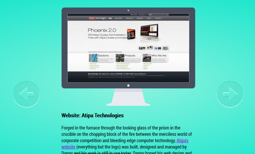
Website: throwitaway.net
Graced with my jQuery plugin–jQuery.popBox.js–throwitaway.net is a dazzling display home-brewed HTML5 3D effects, beautiful graphics, and a dark virtualized presense of it's inspiration: Nine Inch Nails. I'll be featured in the third episode of the podcast, so stay tuned!
Web app: KPR Live Stream Player
With a healthy mixture of JQuery, custom PHP and CSS3, the new KPR Live Stream Player now looks as fantastic as it sounds. The JPlayer plugin–with a customized skin–was installed to handle the playback, PHP is used to query the database for the current program on the air, and CSS3 transistions is used for the super smooth rotating album. Lastly, responsive design was implemented to fit and look good on all screens. Rejoice!
CSS3
/* COMPUTER SCREEN */ .container * { box-sizing: border-box; } .container > .screen { width: 460px; height: 280px; position: relative; background: #ff6860; border: 20px solid #474e5d; border-radius: 10px; -moz-box-sizing:border-box; /* fixes Firefox bug */ } .monitor > div { position: absolute; } .monitor:before, .monitor:after, .laptop:before{ content: ""; position: absolute; left: 50%; } .monitor:before, .laptop:before { top: -10px; margin: -3px 0 0 -3px; width: 6px; height: 6px; border-radius: 6px; background: #a5adbd; } .screen:after { width: 8px; height: 8px; border-radius: 8px; bottom: -10px; margin: 0 0 -4px -4px; background: #e8ebf0; } .content { width: 420px; height: 240px; /*left: 50%; margin-left: -210px;*/ overflow: hidden; } .base { width: 90px; height: 50px; bottom: -70px; left: 50%; margin-left: -45px; background: #e8ebf0; } .base:before, .base:after, .grey-shadow:before, .grey-shadow:after{ content: ""; position: absolute; top: 0; } .base:before { border-left: 13px solid transparent; border-right: 0px solid transparent; border-bottom: 50px solid #e8ebf0; left: -13px; } .base:after { border-right: 13px solid transparent; border-left: 0px solid transparent; border-bottom: 50px solid #e8ebf0; right: -13px; } .base > div { position: absolute; } .grey-shadow { width: 90px; height: 12px; background: #d8dbe1; top: 0; } .grey-shadow:before { border-left: 3px solid transparent; border-right: 0px solid transparent; border-bottom: 12px solid #d8dbe1; left: -3px; z-index: 2 } .grey-shadow:after { border-right: 3px solid transparent; border-left: 0px solid transparent; border-bottom: 12px solid #d8dbe1; right: -3px; z-index: 2 } .foot { background: #e8ebf0; z-index: 1; } .foot.top { width: 116px; height: 5px; bottom: -5px; left: 50%; margin-left: -58px; } .foot.top:before, .foot.top:after, .foot.bottom:before { content: ""; position: absolute; top: 0px; } .foot.top:before { border-left: 16px solid transparent; border-right: 0px solid transparent; border-bottom: 5px solid #e8ebf0; left: -16px; } .foot.top:after { border-right: 16px solid transparent; border-left: 0px solid transparent; border-bottom: 5px solid #e8ebf0; right: -16px; } .foot.bottom { width: 150px; height: 5px; bottom: -10px; left: 50%; margin-left: -75px; z-index: 999; } .keyboard .shadow { bottom: -10px; height: 10px; } .shadow { position: absolute; width: 350px; height: 15px; left: 50%; margin-left: -175px; z-index: -1; bottom: -20px; background: radial-gradient(ellipse at center, rgba(52,172,108,1) 0%,rgba(52,172,108,1) 53%,rgba(46,204,113,1) 55%,rgba(46,204,113,0) 55%,rgba(46,204,113,0) 100%); } /* slideshow controls */ #prev { position: relative; left: -300px; top: -100px; cursor: pointer; } #next { position: relative; left: 300px; top: -100px; cursor: pointer; } #badass { background: url('') 50% 0 no-repeat; height: 300px; position: relative; top: 50px; margin: auto; }

